A digital marketing agency that believes that small actions with the right strategies can build great brands over time.
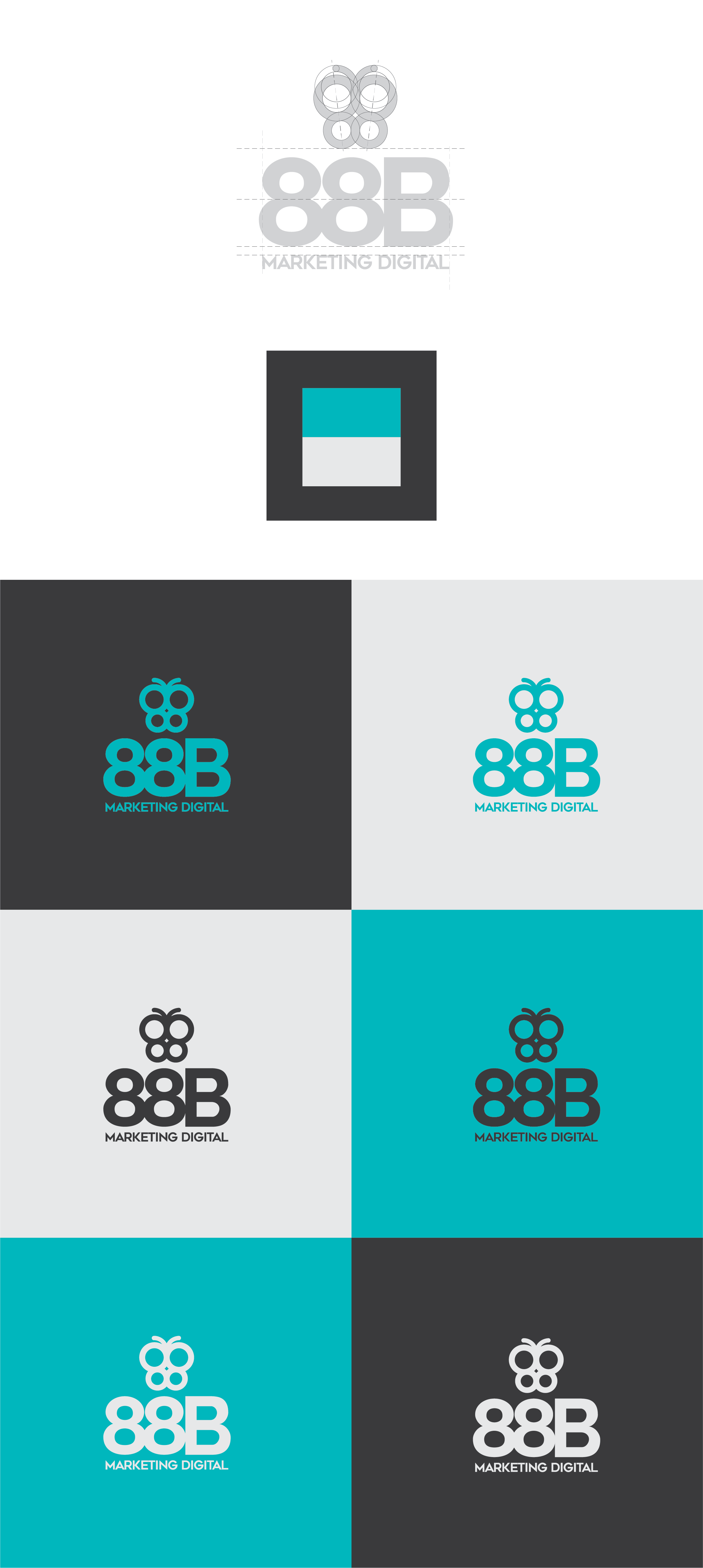
The logo concept is based on the well-known butterfly effect, which is derived from the metaphorical example of a tornado being influenced by minor perturbations, such as the flapping of the wings of a distant butterfly several weeks earlier.
The company's founders chose the name of a famous butterfly named 88 - the design in its wings that resemble two eights.
After some studies and presenting some sketches of ideas, we achieved a result with a modern touch and a strong identity that displays the principles of the company.
The color palette is turquoise and gray - the turquoise represents the ease of communication and the lightness in human relations, while the gray adds sobriety and neutrality, representing the point of balance that marketing must-have.

